The measured gallery wall has a tell: it looks measured. Every gap identical, every edge aligned, the whole thing radiating the anxious energy of a person who spent a Saturday with a level app. The gallery walls you save on Pinterest look like they accumulated over years of good taste. That look is not produced by precision. It is produced by a sequence, and the sequence has five moves.
Move one: pick the anchor and hang it first
Every gallery wall has one boss. The biggest piece, the boldest piece, or the one you would grab in a fire. That is your anchor, and it goes up first, slightly off-center on the wall, at roughly eye level. Everything else on the wall will report to it.
Skipping the anchor is the number one gallery wall failure. Start with small pieces and you get confetti: eight little frames drifting across the drywall with no gravity holding them together. Start with the anchor and every following piece has something to relate to. Decision-making gets easier with each frame, not harder.
If you do not own an anchor yet, buy a set that includes one. A good print set arrives pre-curated, with one or two larger pieces that can lead and smaller ones that follow.

Eclectic Wall Art Print Set
What it is A ready-made gallery wall of colorful eclectic prints that turns a blank wall into a point of view. The set is curated to hang together, which means the hardest part, making unrelated art look related, is already done.
Style it Promote the boldest print to anchor status and let the rest orbit it. Mix in one thing you already own so the wall reads collected, not shipped. More on this one on its product page.
Move two: lay it out on the floor, not the wall
Here is the trick that replaces every template and app: the floor. Clear a patch of floor in front of the wall, roughly the same width. Lay the anchor down first, then arrange everything else around it. Shuffle freely. The floor forgives; drywall holds grudges.
Work from the anchor outward, and stop arranging the moment it looks right rather than the moment it looks even. Then take a photo from directly above. The photo matters more than the layout, because a camera flattens the arrangement the way a visitor's eye will, and imbalances you cannot see standing over it will jump out of a thumbnail instantly. Too much visual weight on the left, a gap that reads like a missing tooth, two busy prints touching: the phone sees all.
When the photo looks good, you hang in the same order you laid: anchor first, then the pieces touching it, then outward to the edges. You are copying your own floor, one frame at a time, checking the photo as you go. That is the entire system.
Move three: space by hand, literally
The hand-width rule above does the work a tape measure pretends to. Keep gaps in the two-to-three-inch family and small variations disappear at viewing distance. What kills a gallery wall is not a gap that is half an inch generous. It is gaps of wildly different orders: one inch here, eight inches there. Your hand prevents the disasters and ignores the trivia, which is the correct priority.
Same logic for height. The center of the whole cluster should land around eye level, and the anchor already set that when you hung it. No numbers required. If you find yourself on a ladder or crouching to hang a frame, the composition has wandered; pull it back toward the anchor.
Move four: mix the sizes on purpose
Uniform frames in a uniform grid is a real look, but it is not a gallery wall; it is wallpaper with extra steps. The collected look needs contrast: big with small, tall with wide, one round or oval thing among the rectangles. Odd numbers of each size beat even numbers. Three small, two medium, one anchor is a composition. Four and four is a spreadsheet.
Mix content, too. Prints with a photograph, a small mirror, something dimensional like a woven piece or a tiny shelf. And vary the frames themselves: two woods, one black, one brass is plenty of range. When every frame matches, the wall looks bought in one afternoon, and the entire point of a gallery wall is pretending you didn't.
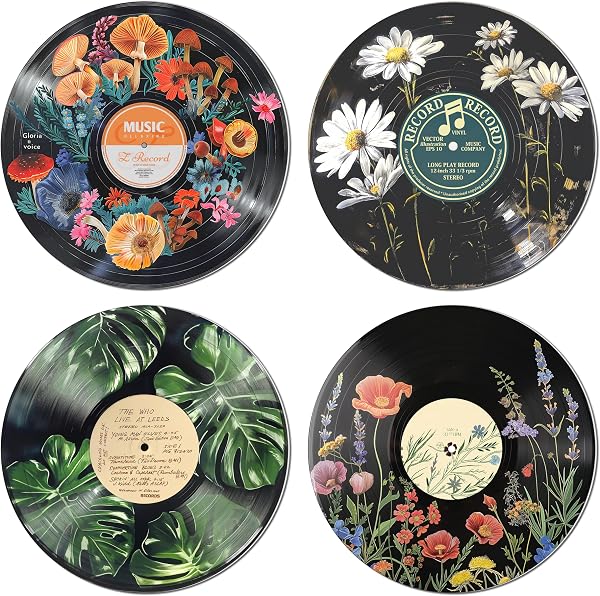
Botanical Wall Art Print Set
What it is A four-piece botanical poster set with a vintage-record aesthetic. Frame them or clip them up for an instant gallery wall, or split the set across a bigger arrangement as your supporting cast.
Style it Four is an even number, so do not hang them as a block. Scatter three among other pieces and give the fourth to the hallway. Details on the product page.
Move five: stop one frame early
A gallery wall is done before the wall is full. The blank space around the cluster is load-bearing: it is the frame around the whole composition, and it is what separates "curated collection" from "visual hoarding." When you catch yourself thinking one more piece would fill that corner nicely, that thought is the signal to put the hammer down.
The practical test: step back to the doorway. If your eye lands on the anchor first, tours the cluster, and exits cleanly, you are done. If your eye does not know where to land, you are one or two frames over, not under. Take away the weakest piece and watch the whole wall improve. Editing is free; it is also the most expensive-looking move in decorating.
One more permission slip: gallery walls are allowed to grow later. Hang seven pieces today and add the eighth in October when you find it. Walls that accrete are exactly how the collected look got its name.
That is the entire method: anchor first, floor before wall, hand-width gaps, sizes in deliberate disagreement, and a hard stop one frame early. No lasers were involved. If your wall needs more raw material, the bold end of the pool is the Energetic & Modern mood, and every print, mirror, and weird little wall object I have vetted is in one place below.